Directive Blogs
Displaying Data Charts in PowerPoint and other Microsoft Office Apps
Last time we went over how to dress up your PowerPoint presentations with SmartArt, a feature in many Microsoft Office applications. Today we're going to be showing you how to create charts to display various types of data in PowerPoint, but like before, these will work much the same in other Office products such as Microsoft Word.
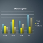
If a picture is worth a thousand words, then perhaps a chart is worth a thousand numbers? A well-constructed graph or chart can give viewers a very quick overview of a whole lot of data, and can compliment your presentation. Making charts in PowerPoint 2010 is easier than ever. Start with a blank slide in PowerPoint. Go to the Insert tab and click the Chart option. You'll be presented a lot of options for various charts and graphs. Depending on how you want to visualize your data, select the appropriate type of graph. Once you select the char t you want to use, an Excel window will pop up with some default data. The data will be arranged a little differently depending on your chart type, but if you compare the excel file with the sample chart now in your presentation, you can correlate what cell represents certain areas in your chart. Change the data in the spreadsheet and the chart will adjust itself in real time. When you are done inserting your data, you can simply close out of the excel spreadsheet. You don't need to save it. Now that you have your chart, you can select it in PowerPoint and go to the Chart Tools tab and adjust things like color and style. There are plenty of options to add nice visual effects to your chart without making it look too cheesy. Are you looking to improve the way you make and broadcast presentations? Give us a call at 607.433.2200 for meeting, teleconference, and webinar solutions!


